Complete Brand Kit
Treasures of Byzantium is a startup e-commerce brand specializing in jewelry and religious items inspired by the Byzantine period. Drawing from centuries-old pieces and iconographic images, crafted by modern artists and craftsmen, the brand distinguishes itself with unique collections and styles.
As Treasures of Byzantium prepares to enter the market, it is crucial to evaluate how the brand presents itself to its audience. We need to create something that generates more than just interest; we need to build momentum that makes Treasures of Byzantium impossible to ignore. The brand must articulate a compelling proposition, clearly standing for something that captures imaginations and sets it apart from its competitors.
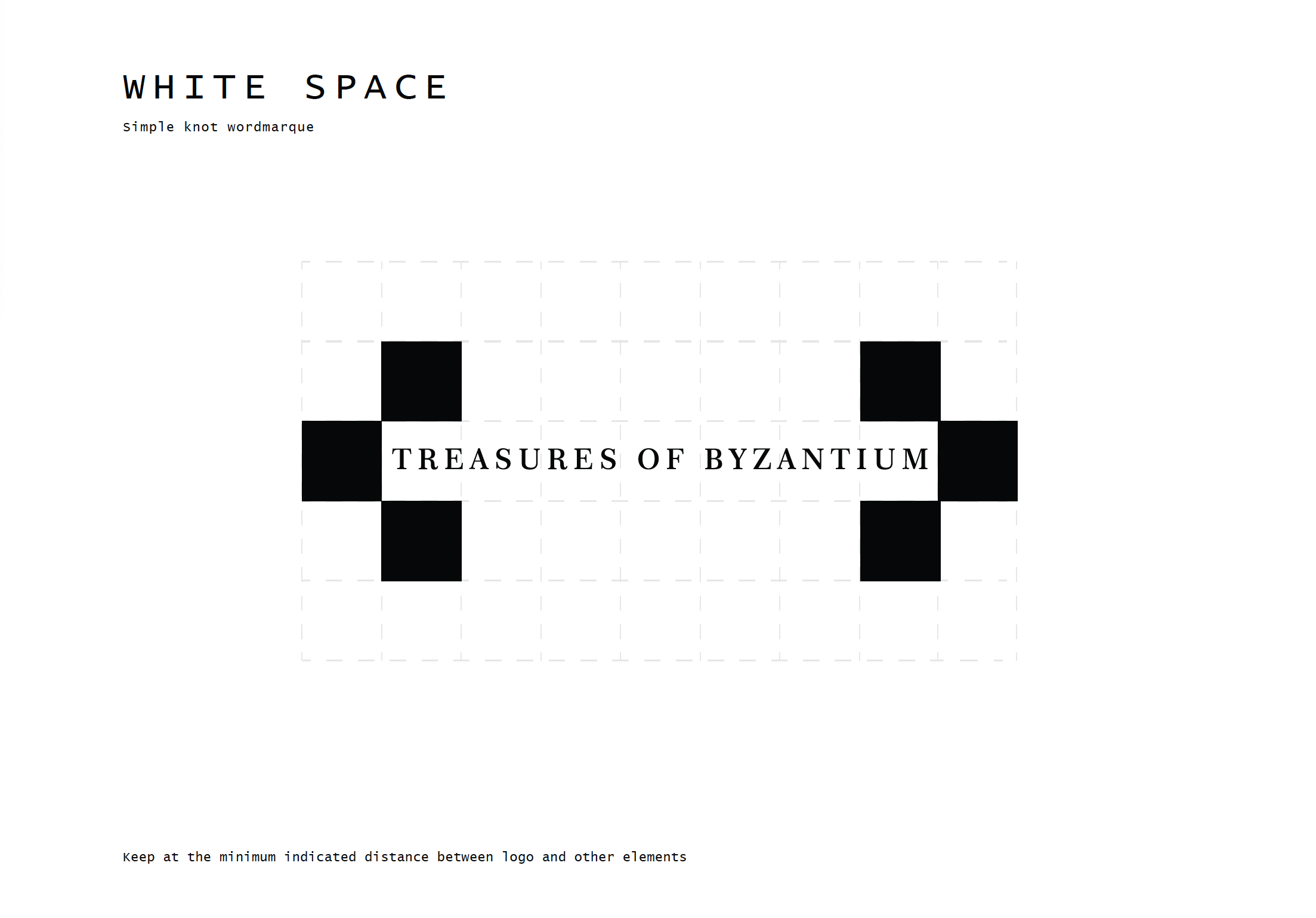
To realize its potential, the business requires a comprehensive set of tools that set the scene and tone for success. This goes beyond just a logo; it's a toolkit to build brand awareness and a lasting legacy.

Colour Palette
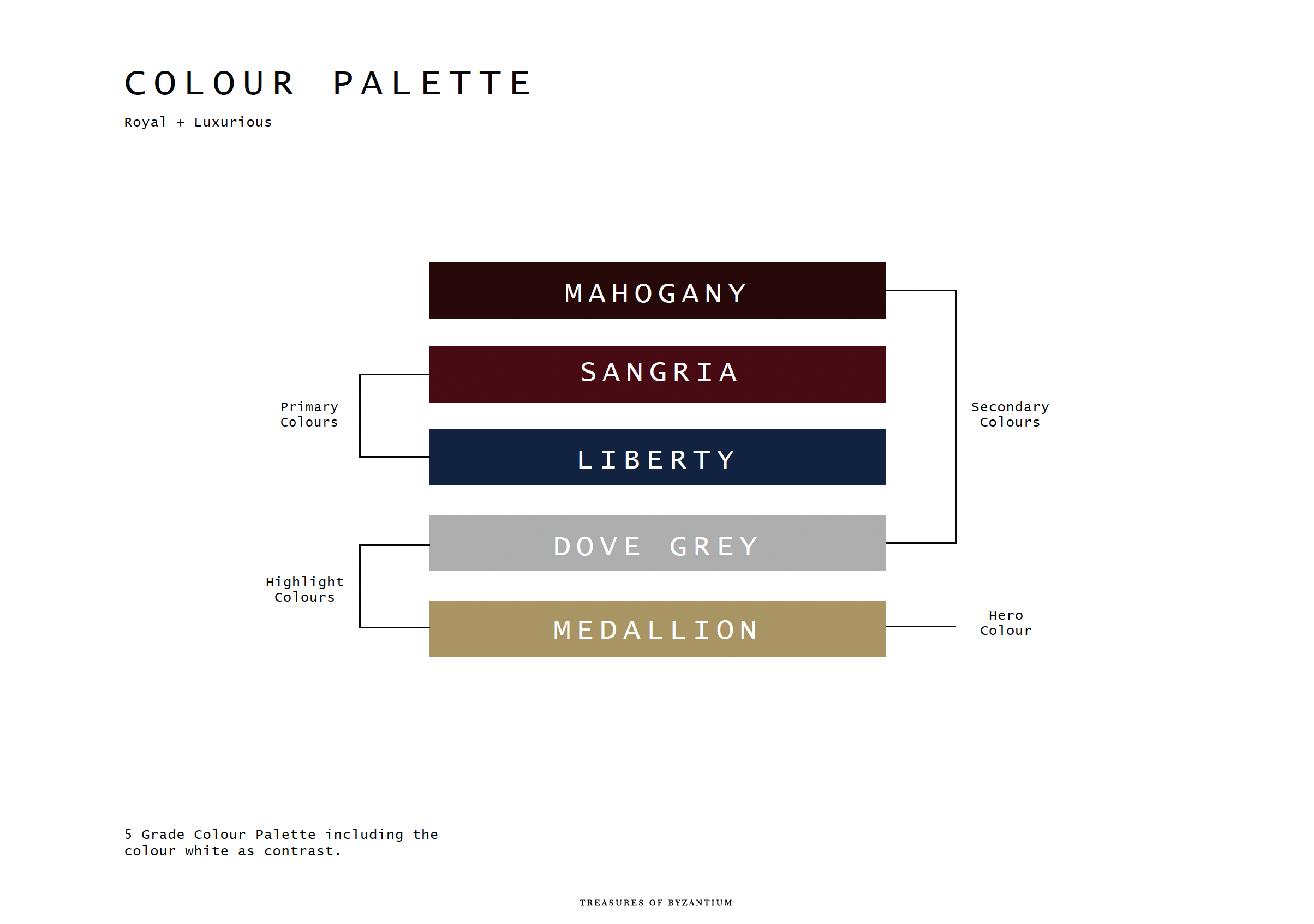
The colour palette of Treasures of Byzantium consists of a four-tier tonal scheme, chosen for its strong ties to Byzantine luxury and imperialism, as seen in the mosaics and art of that era. The gradient from dark to light provides striking contrast and can be seamlessly and aesthetically integrated into the brand's visual identity.


Font Type
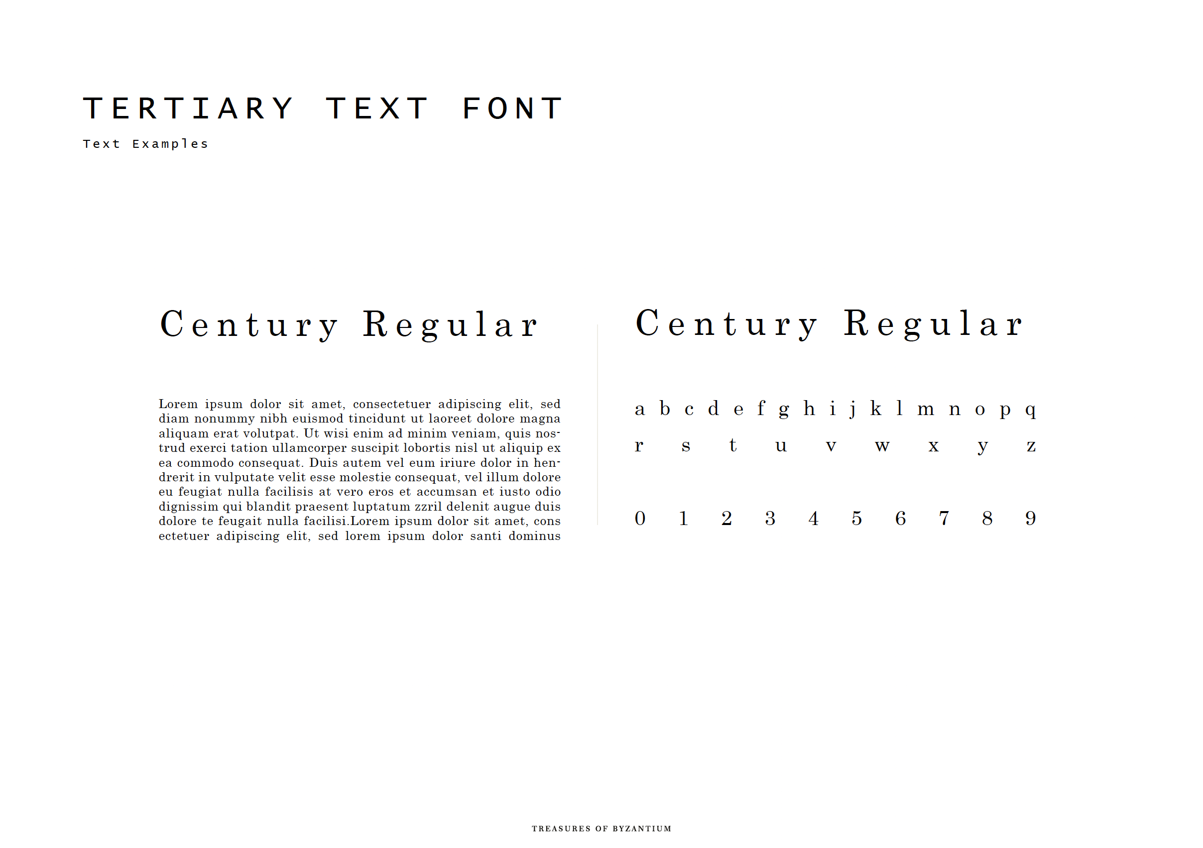
Treasures of Byzantium expresses its character through carefully selected typography, utilising both capital and lowercase letters for titles and body text. This is paired with a handwritten calligraphic font that adds contrast and personality. The combination of these two fonts demonstrates adaptability, versatility, and distinction in the brand's visual identity.


Character, Values & Tone
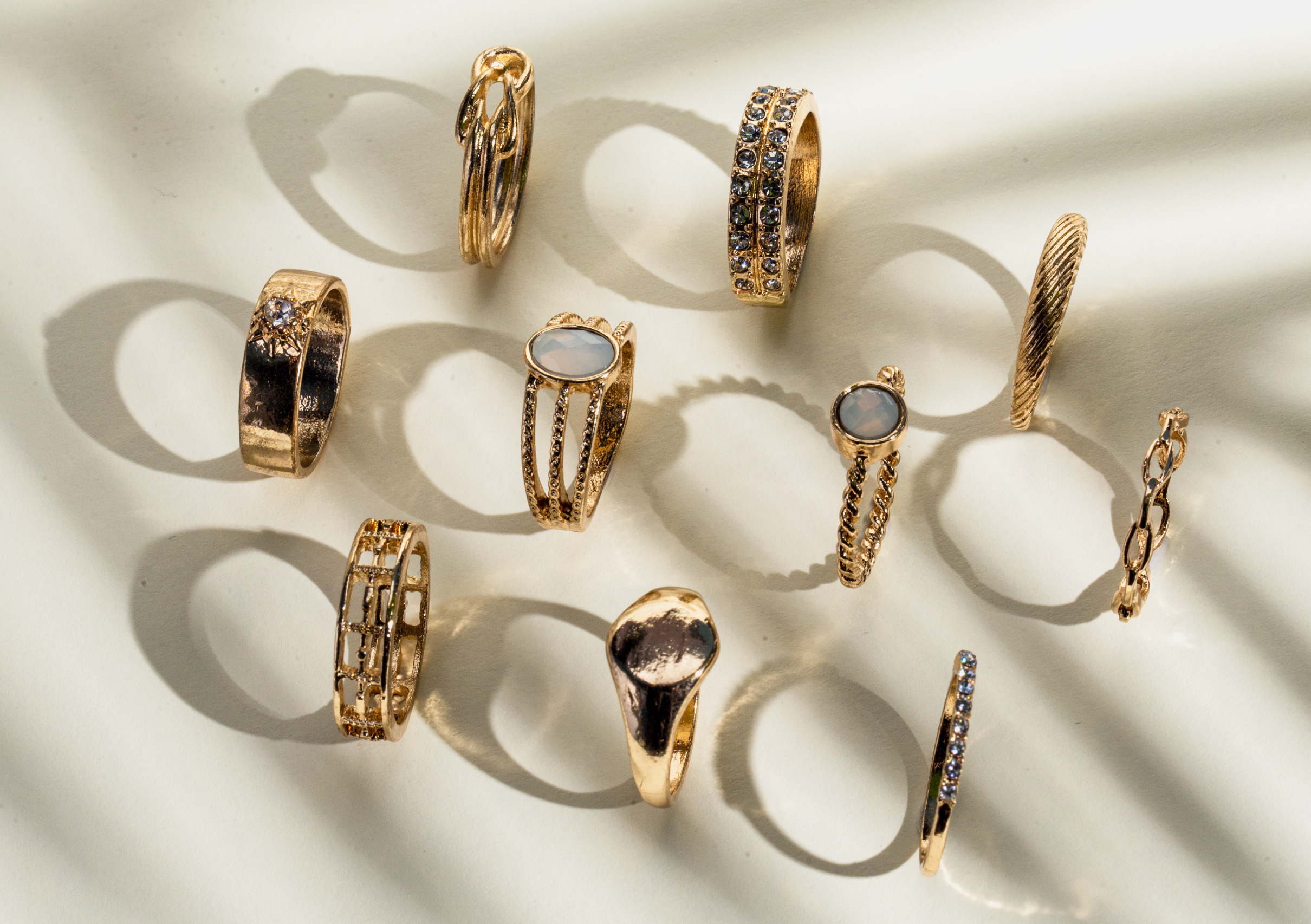
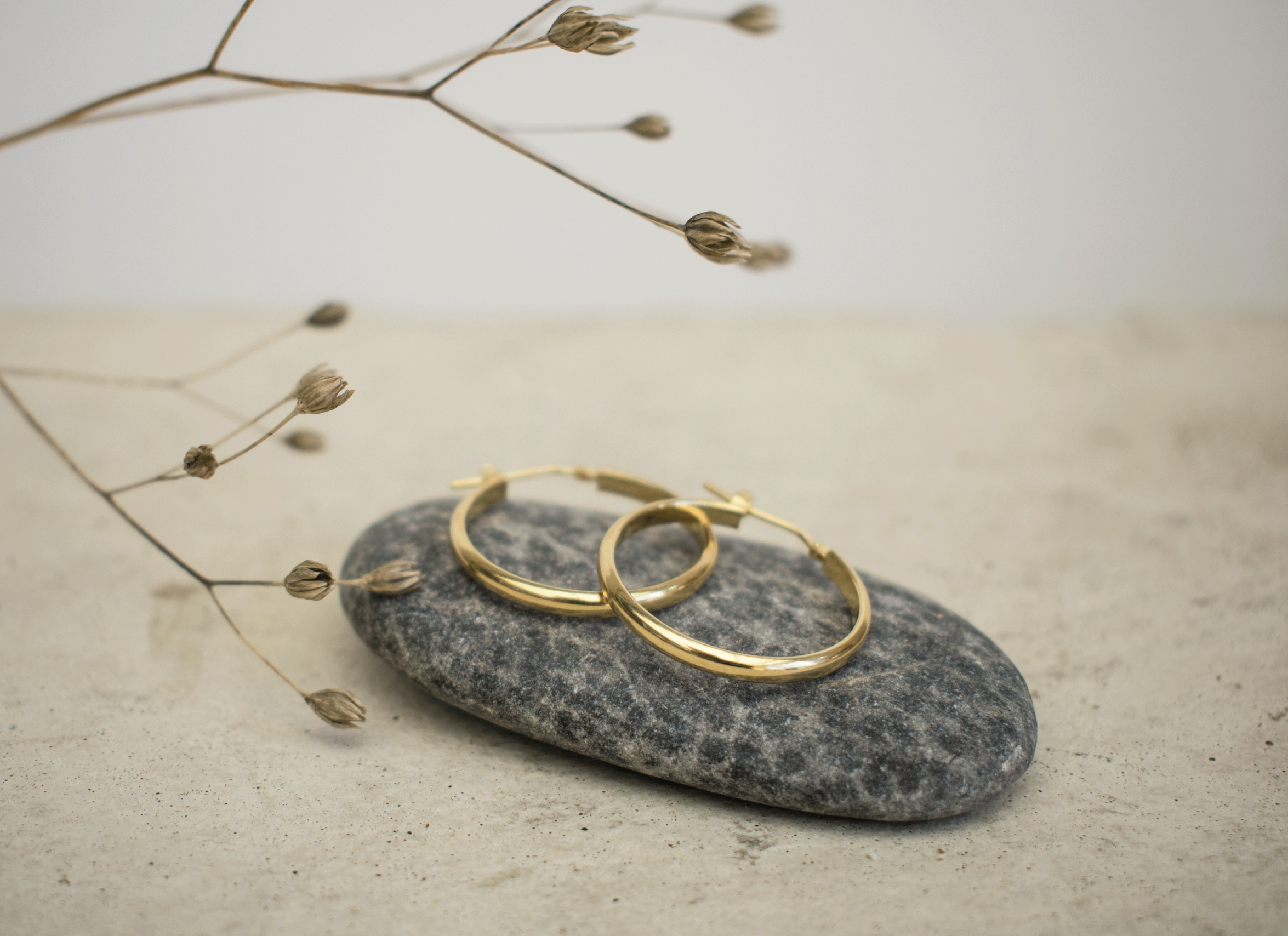
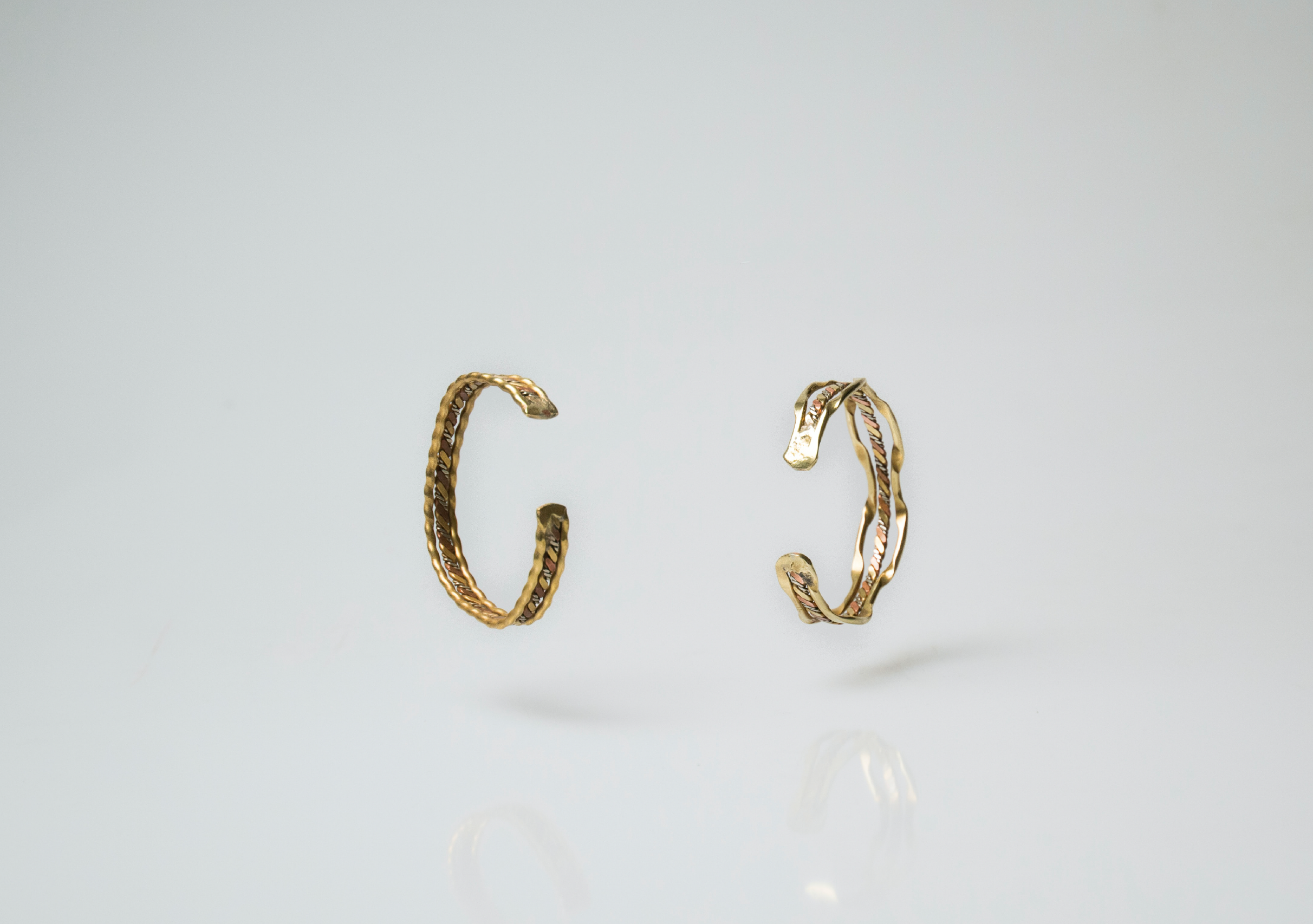
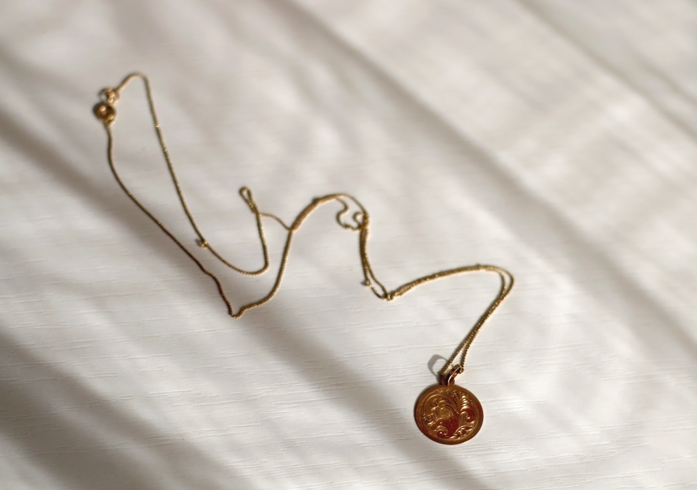
Style of Imagery
To establish a strong brand character, Treasures of Byzantium (ToB) must be guided by a distinct set of defining pillars to propel the business forward. The brand needs a clear purpose: to present a trustworthy and luxurious image for both current and prospective clients.
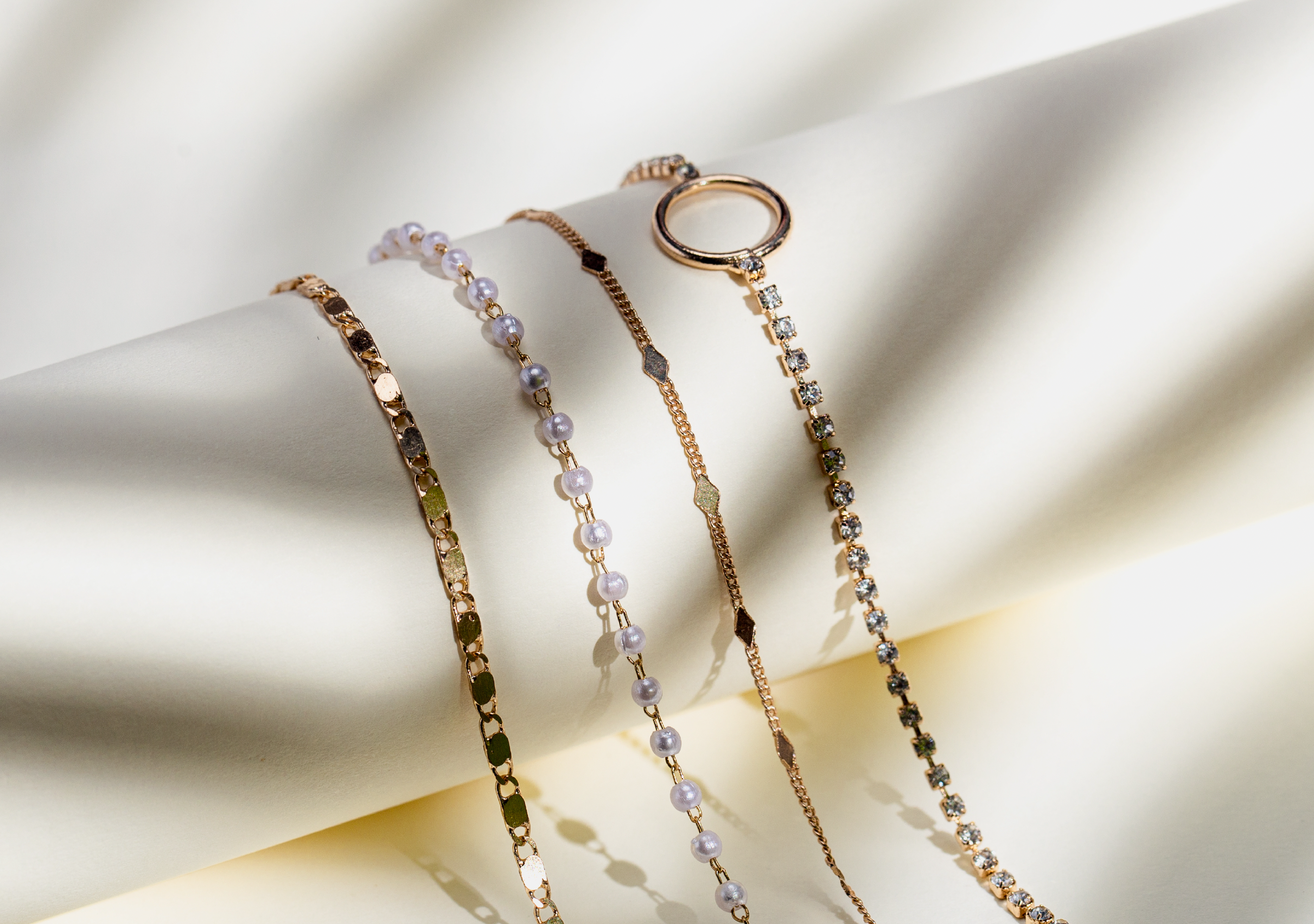
Imagery plays a crucial role in shaping the brand's look, feel, and overall aesthetic. It evokes emotion, creates impact, and defines character. Treasures of Byzantium employs a blend of portraiture and nature to effectively convey its identity and message.


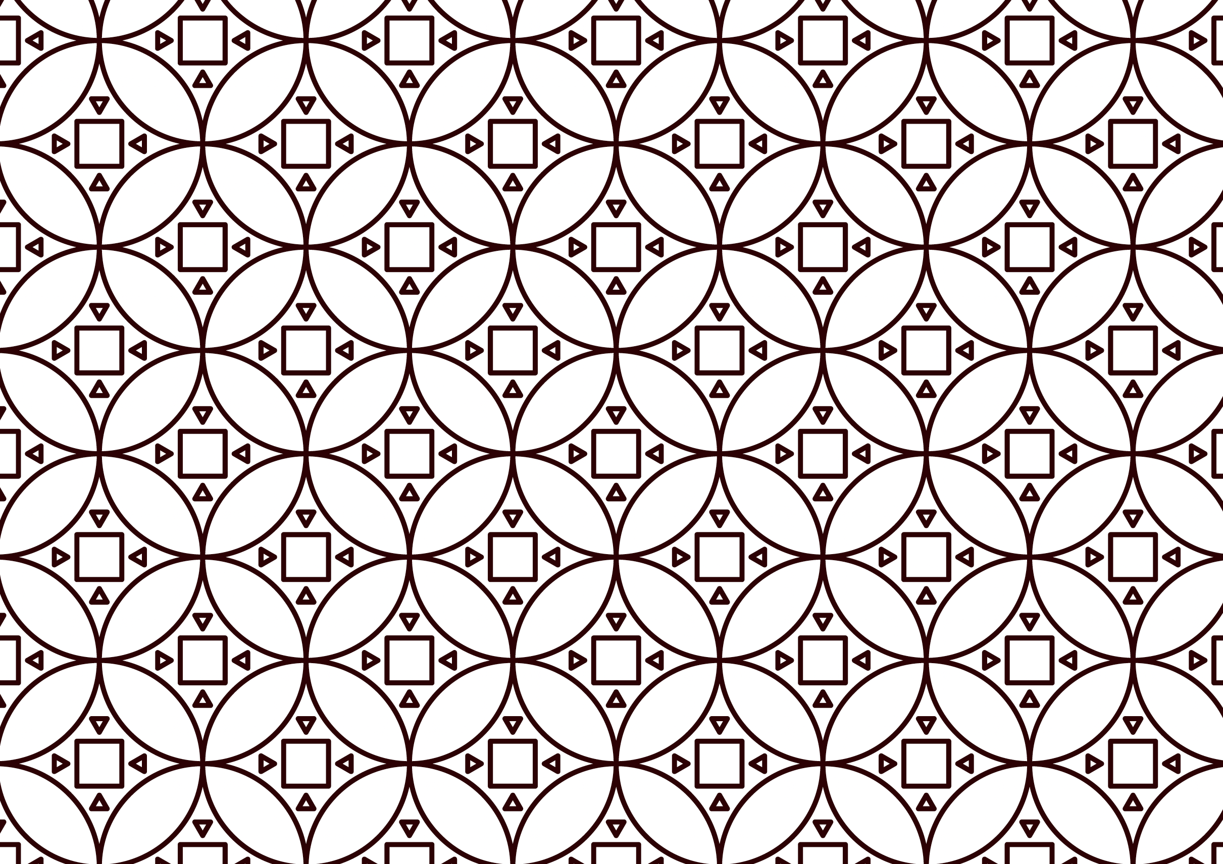
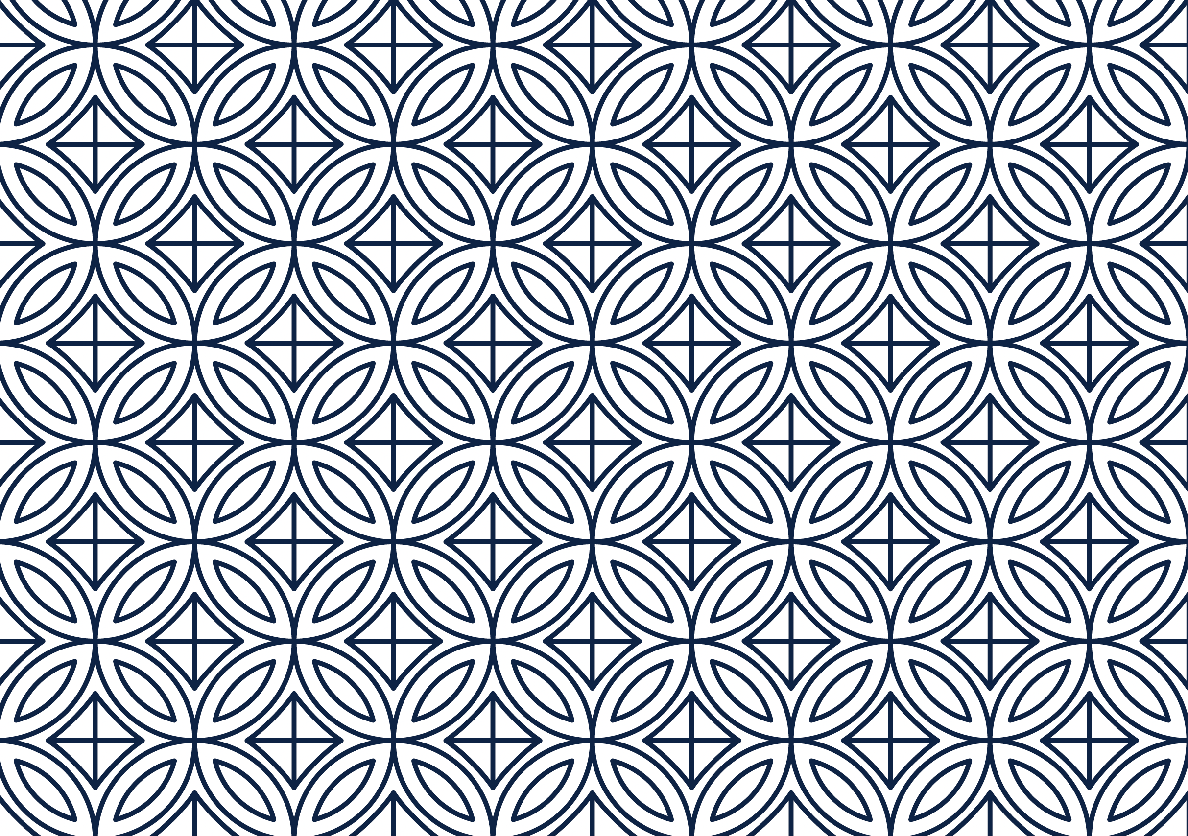
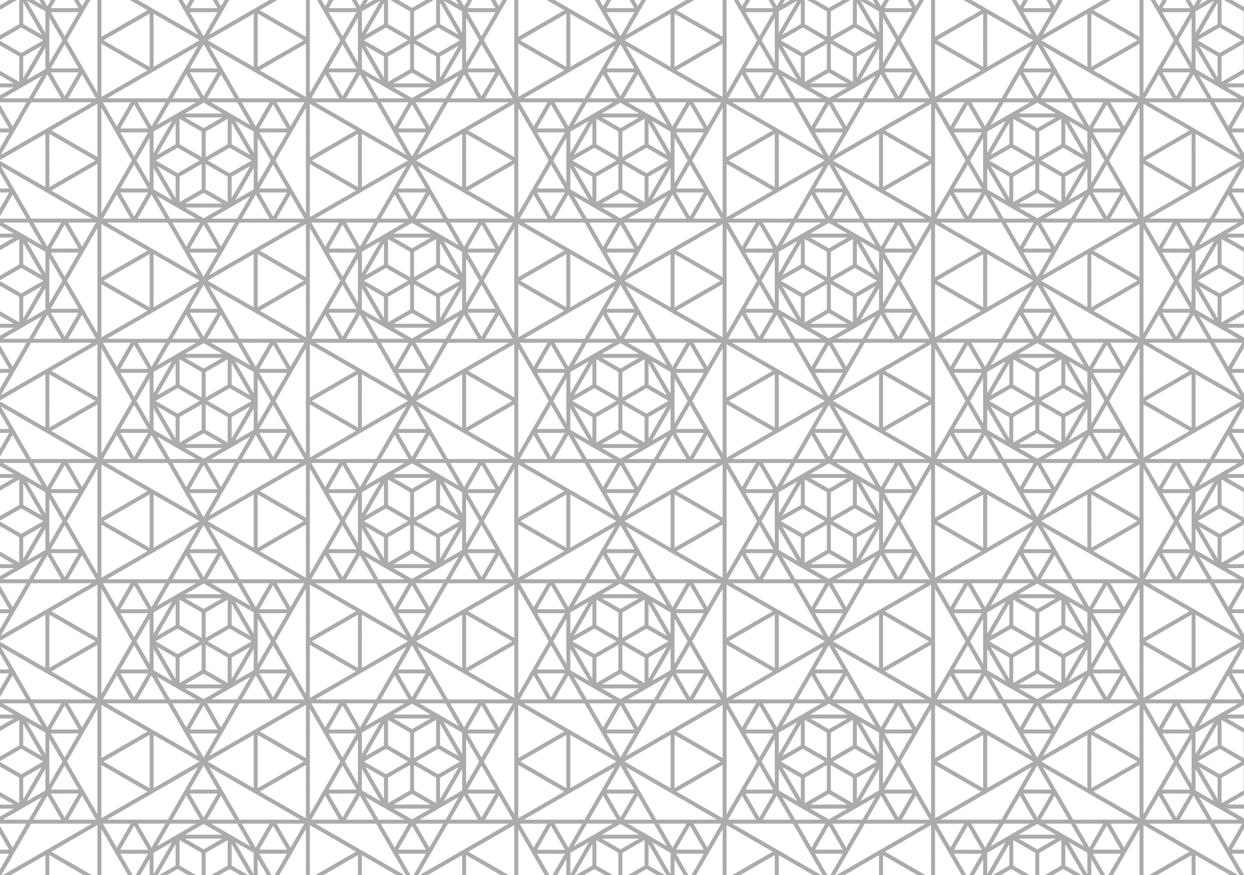
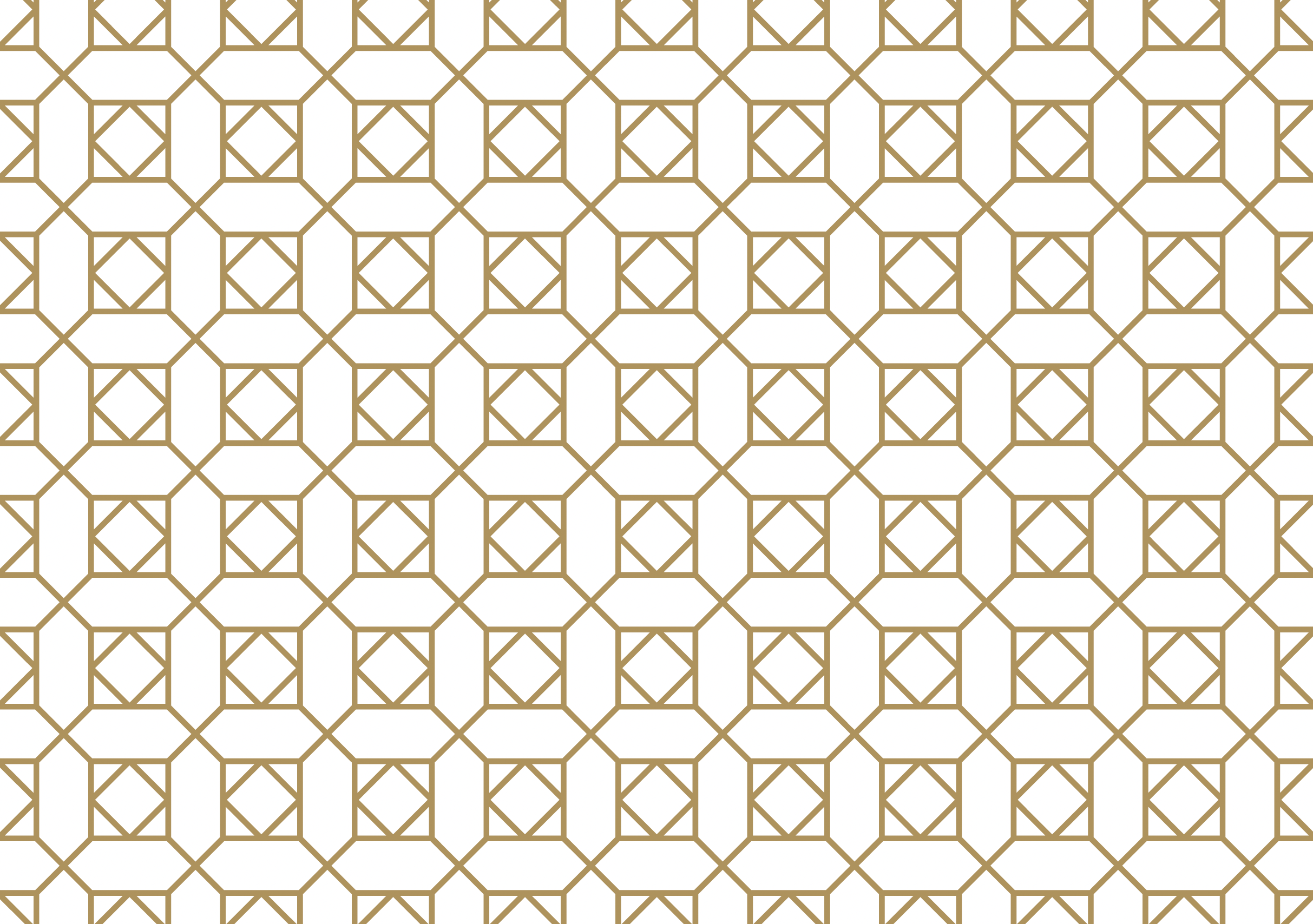
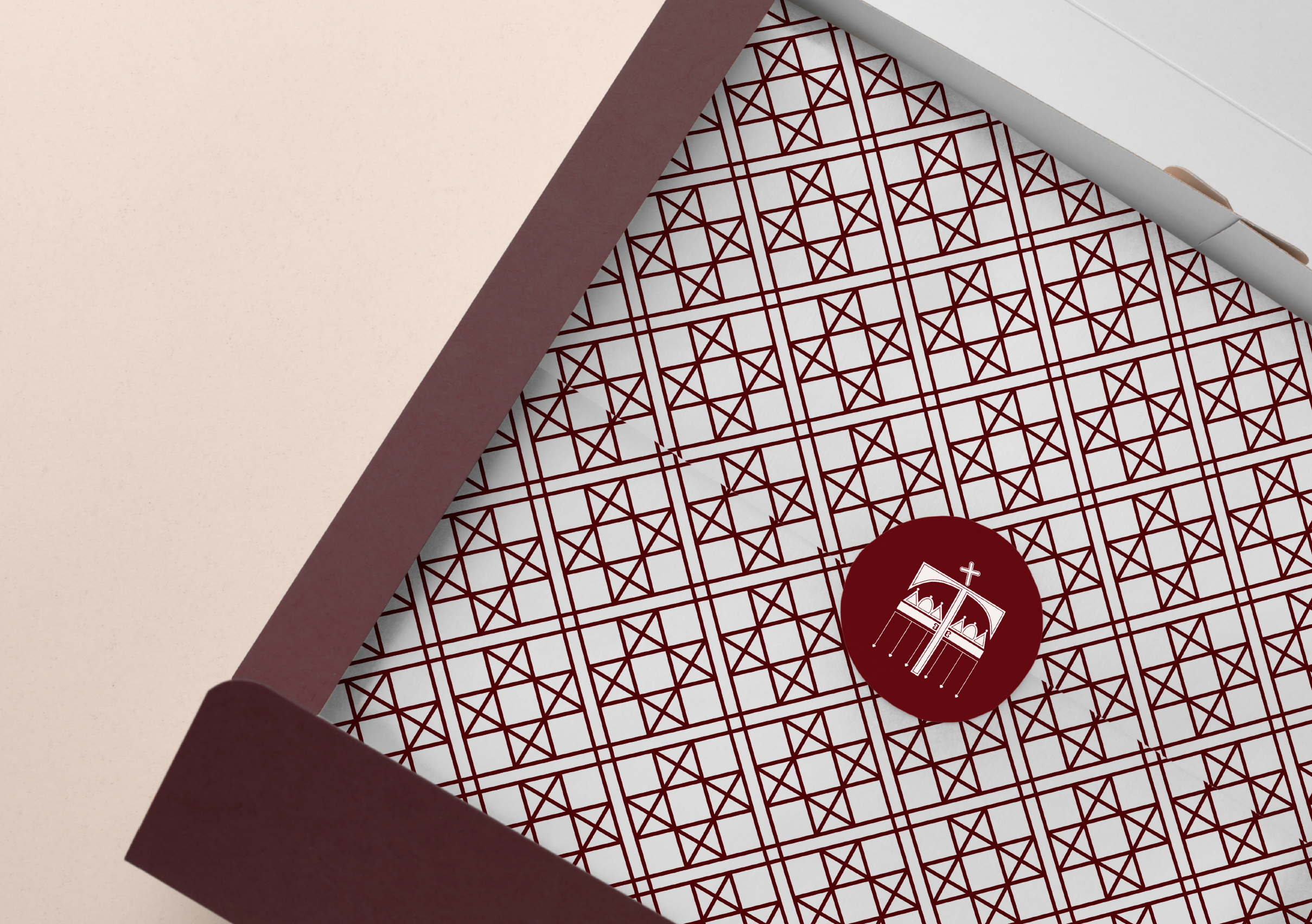
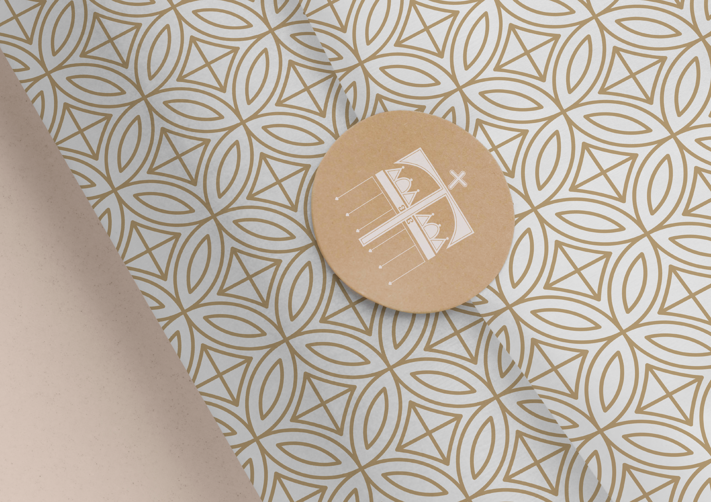
Design Elements / Pattern
By incorporating simplified Byzantine patterns, we create geometric designs ideal for backgrounds, packaging, and more. These elements can be seamlessly integrated across various marketing materials, social media accounts, and the website.

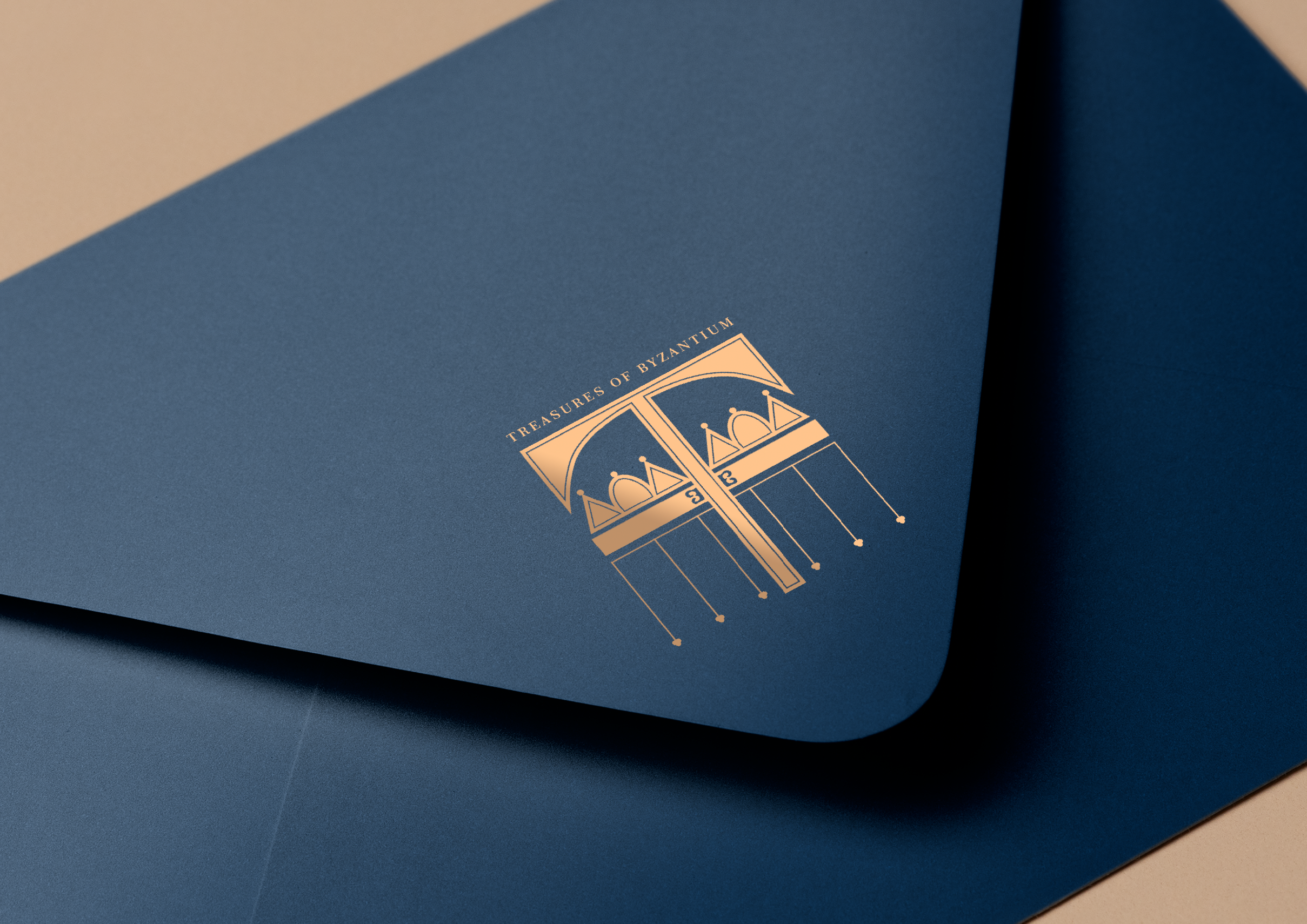
Brand Stationary
Exploring ways to incorporate the brand's artistic elements into physical stationery, such as business cards and letterheads, allows for a cohesive brand identity. These design concepts can be effectively reflected across various media.


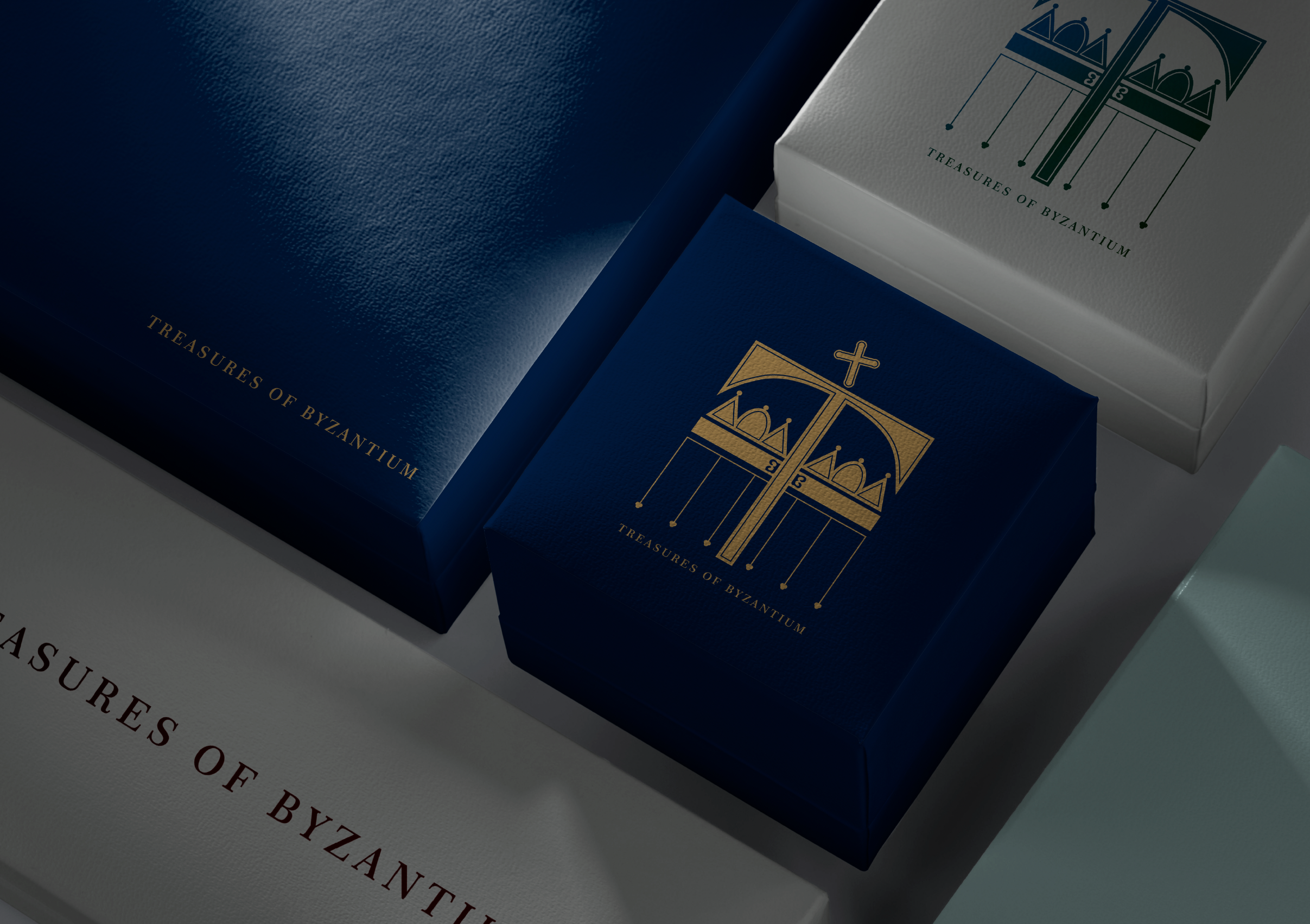
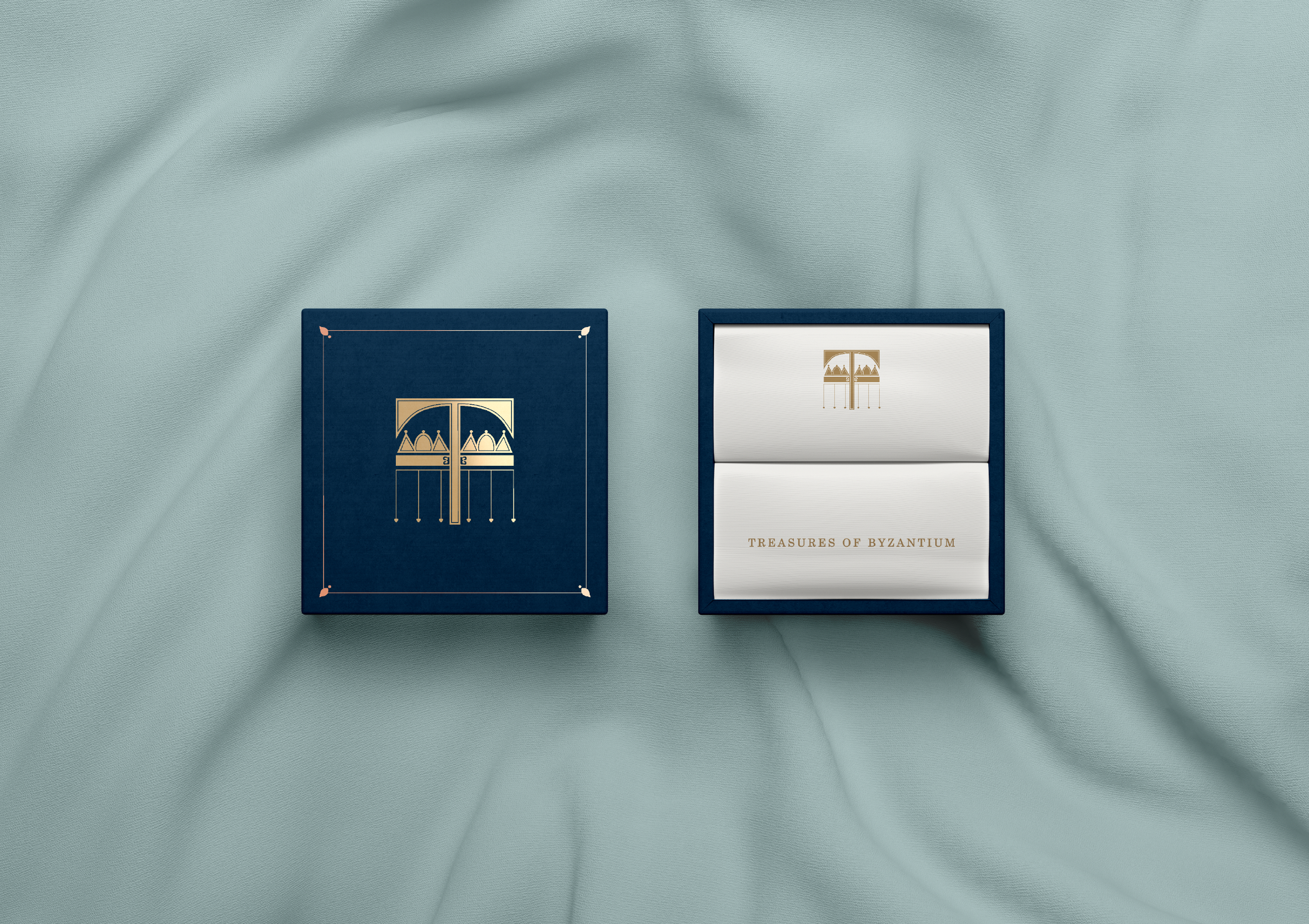
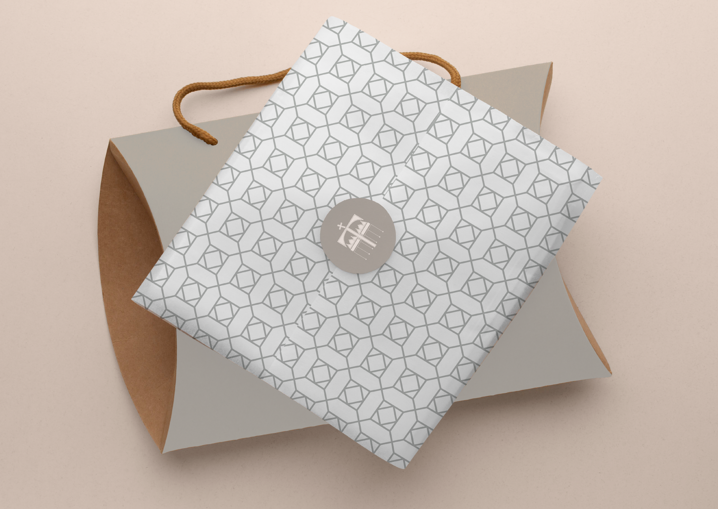
Packaging Design
Exploring various packaging styles involves the thoughtful use of colours, patterns, logo icons, and wordmarks. By experimenting with different combinations, we can create visually appealing and distinctive packaging that reflects the essence of Treasures of Byzantium.


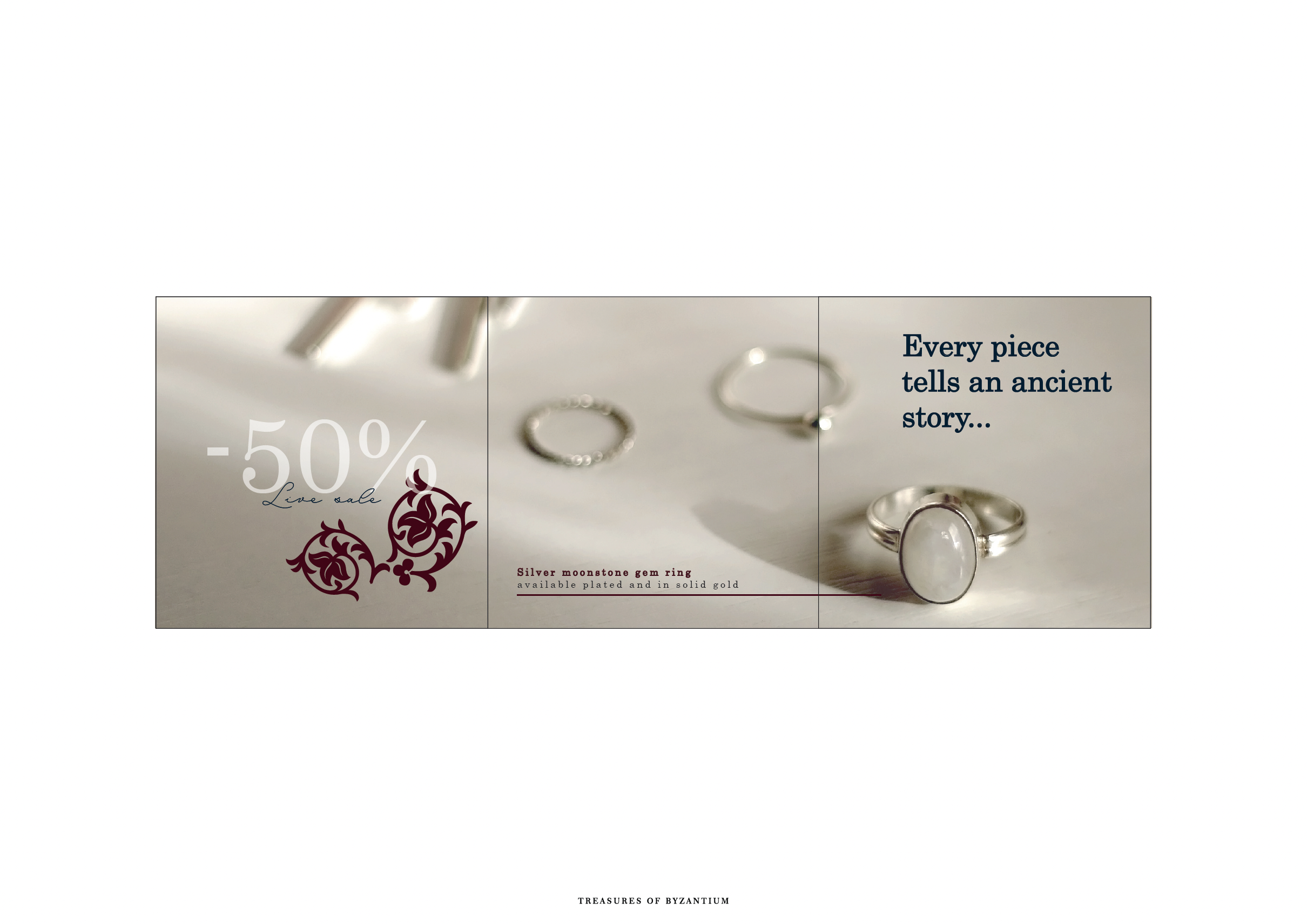
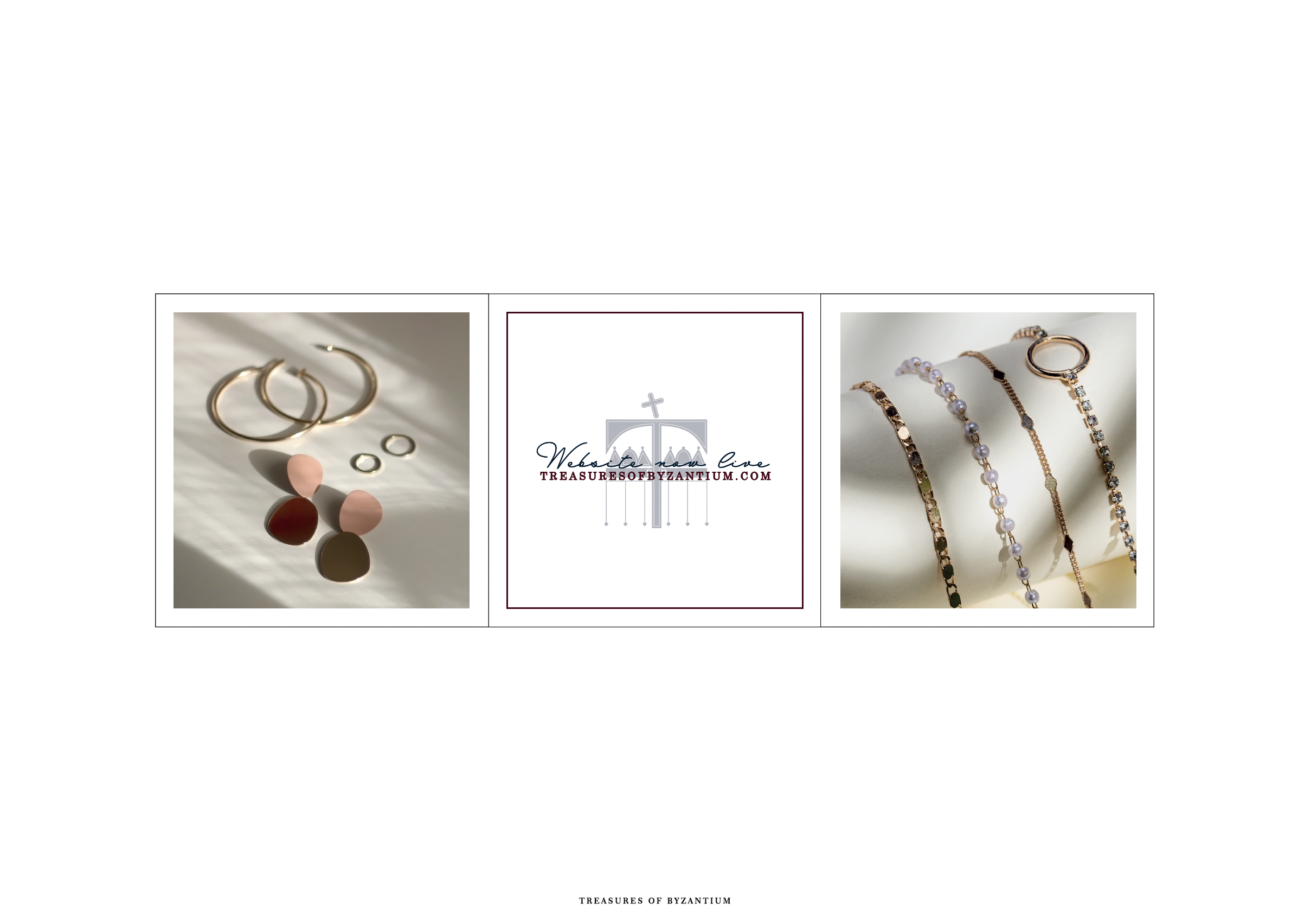
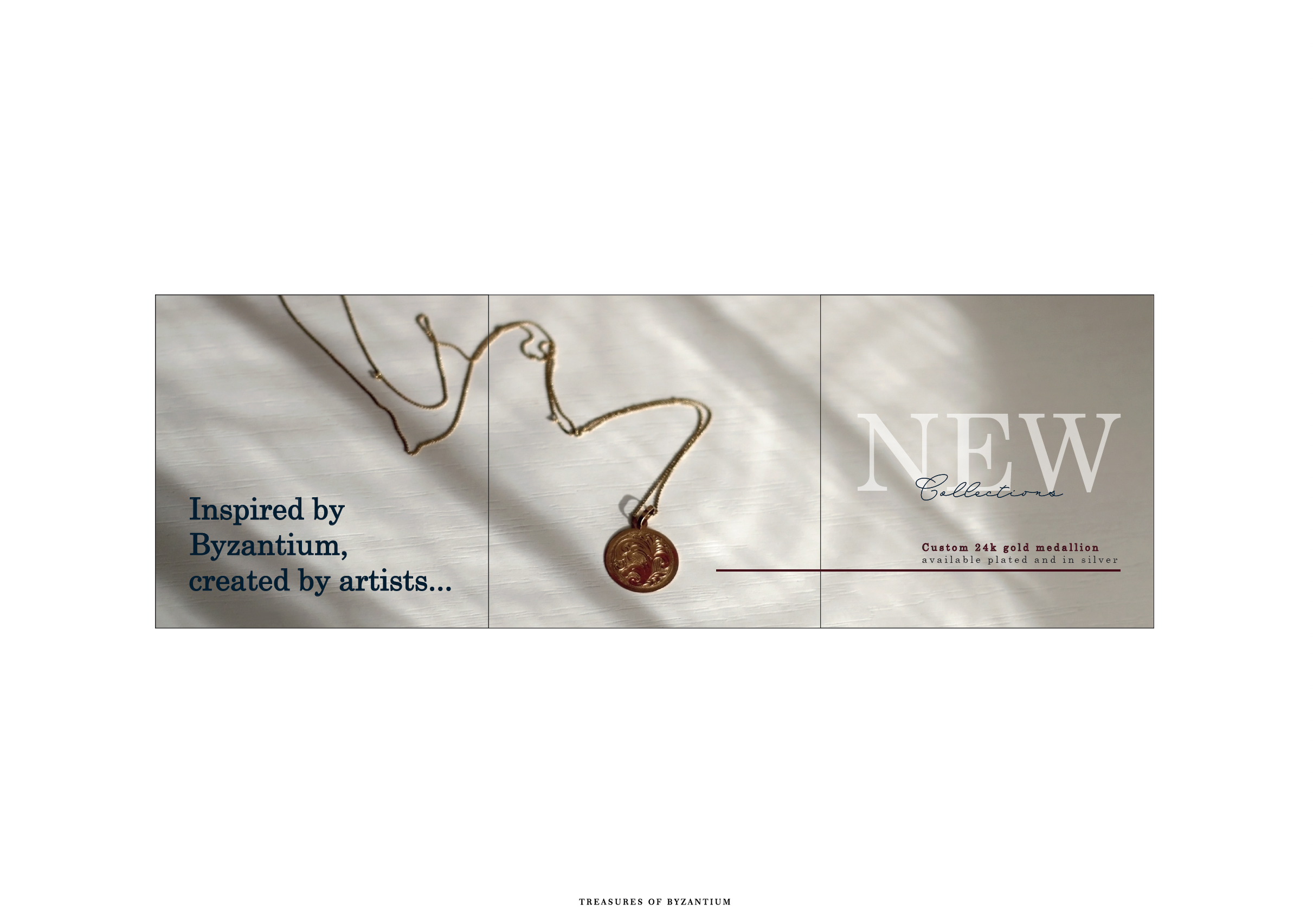
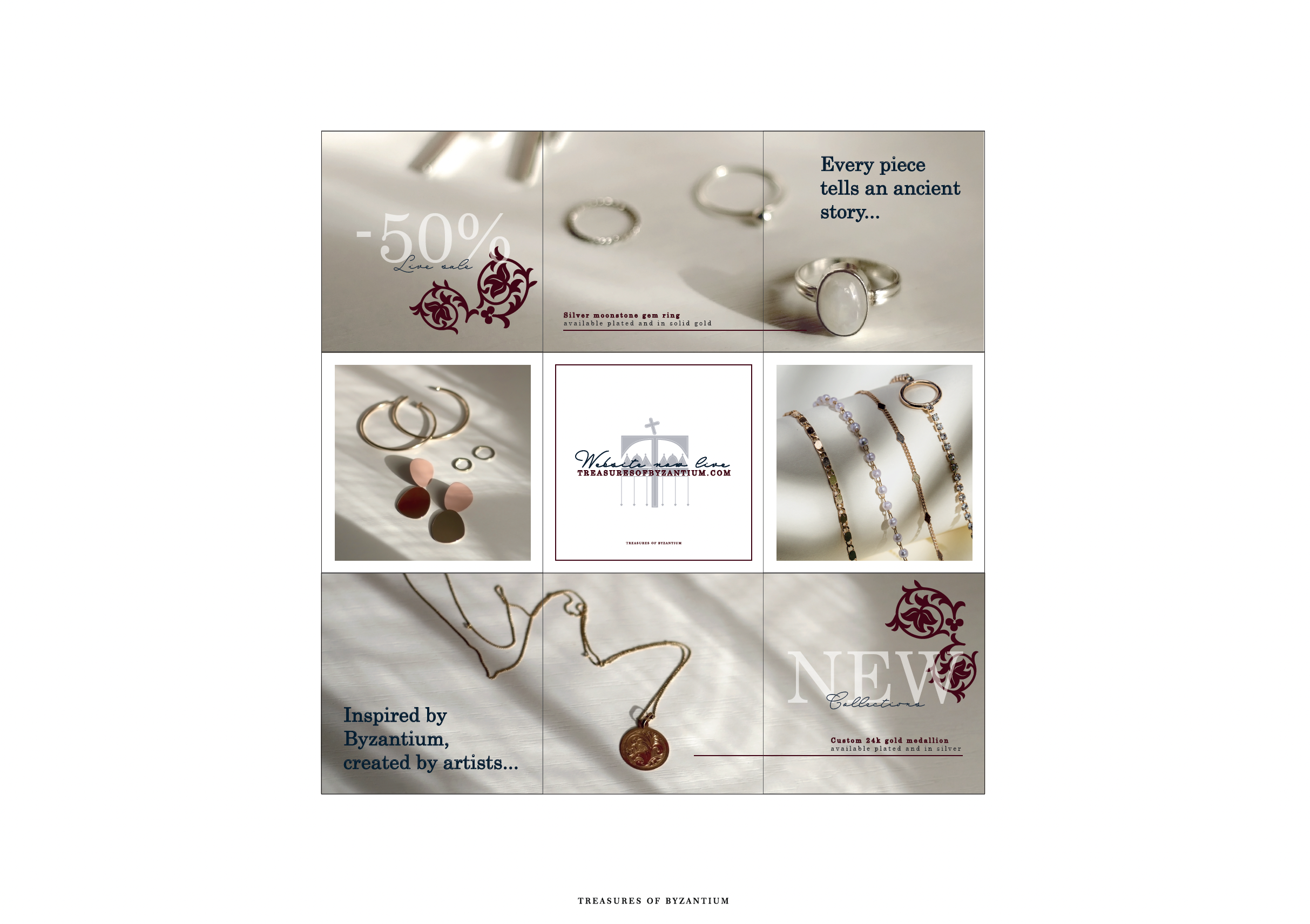
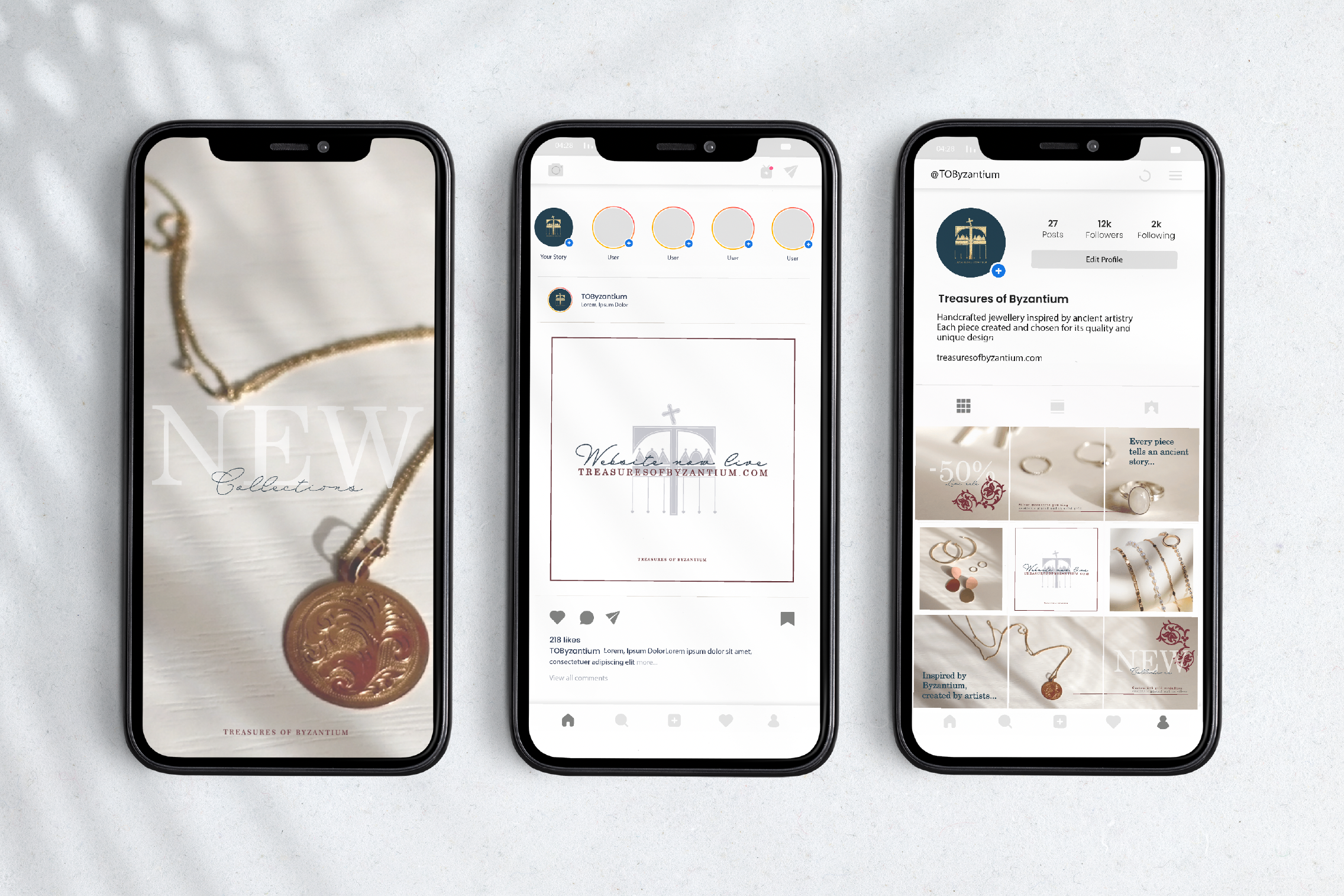
Social Media - Instagram
Developing nine Instagram post designs which will serve as inspiration for ToB social media strategy. Utilising a checkerboard layout, these designs will feature a mix of text-based posts and imagery. This approach promotes the website, sales, and products effectively. The text posts will highlight key messages, promotional offers, and brand values, while the imagery will showcase the beauty and craftsmanship of the products. By blending these elements, we create a visually engaging and cohesive Instagram feed that captures the attention of our audience and drives engagement with Treasures of Byzantium.