Core Brand Kit
ORAYA Retreats draw inspiration from their Greek etymology, with the name derived from the word meaning "beautiful." This essence of beauty is central to ORAYA, offering experiences rooted in enhancing well-being and mindfulness within serene and natural surroundings.
ORAYA caters to those seeking a unique getaway, where guests can unwind, rejuvenate, and rediscover their inner balance in an intimate, peaceful setting under the Tuscan sun. Creating beautiful experiences is at the heart of the brand and should extend seamlessly into every facet of its identity – from the logo and typography to the colour palette. Every element should reflect the brand's commitment to providing a serene and rejuvenating escape.


Logo & Spacing
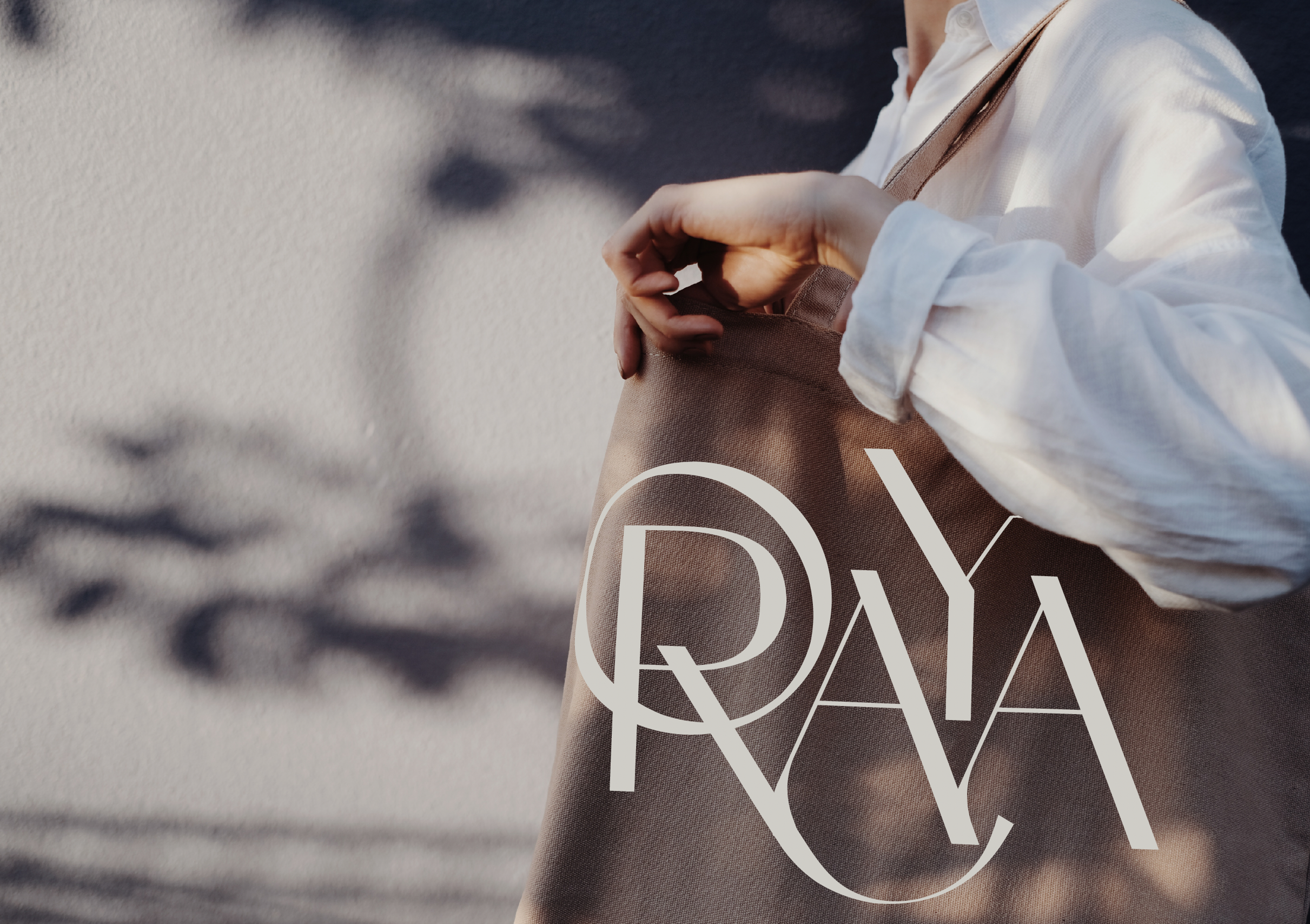
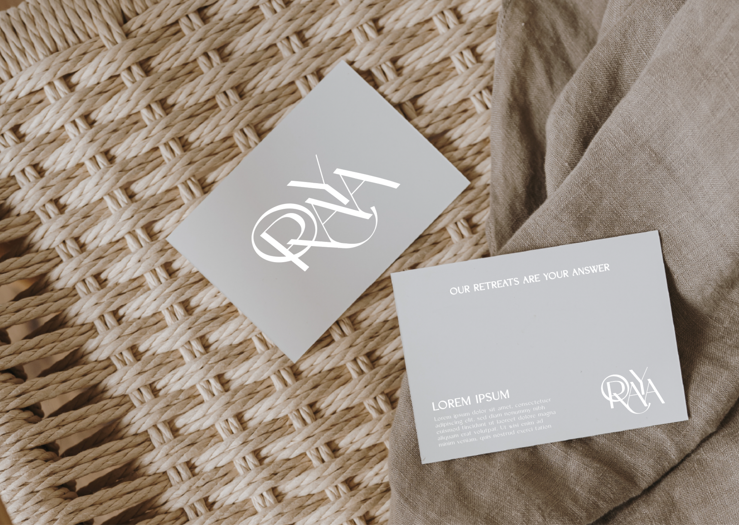
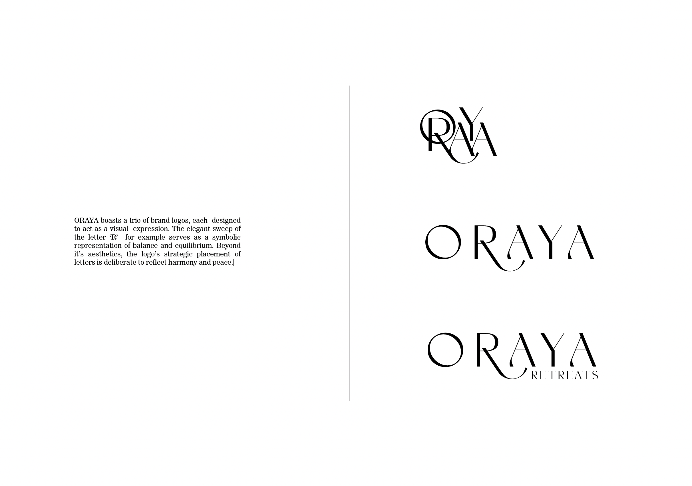
ORAYA features a trio of brand logos, each meticulously designed to serve as a visual expression of the brand's essence. The elegant sweep of the letter ‘R,’ for instance, symbolises balance and equilibrium. Beyond its aesthetic appeal, the strategic placement of the letters is intentionally crafted to reflect harmony and peace, reinforcing the brand's commitment to creating serene and rejuvenating experiences.


Font Type
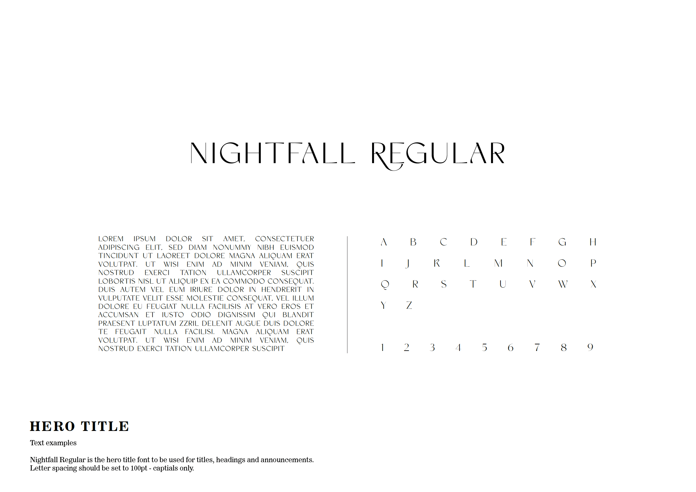
Nightfall:
Nightfall is used for the main headers and titles, delivering a sleek and elegant aesthetic. Its refined curves and clean lines reflect the brand’s luxurious and serene nature, perfect for conveying a sense of tranquility with sophistication.
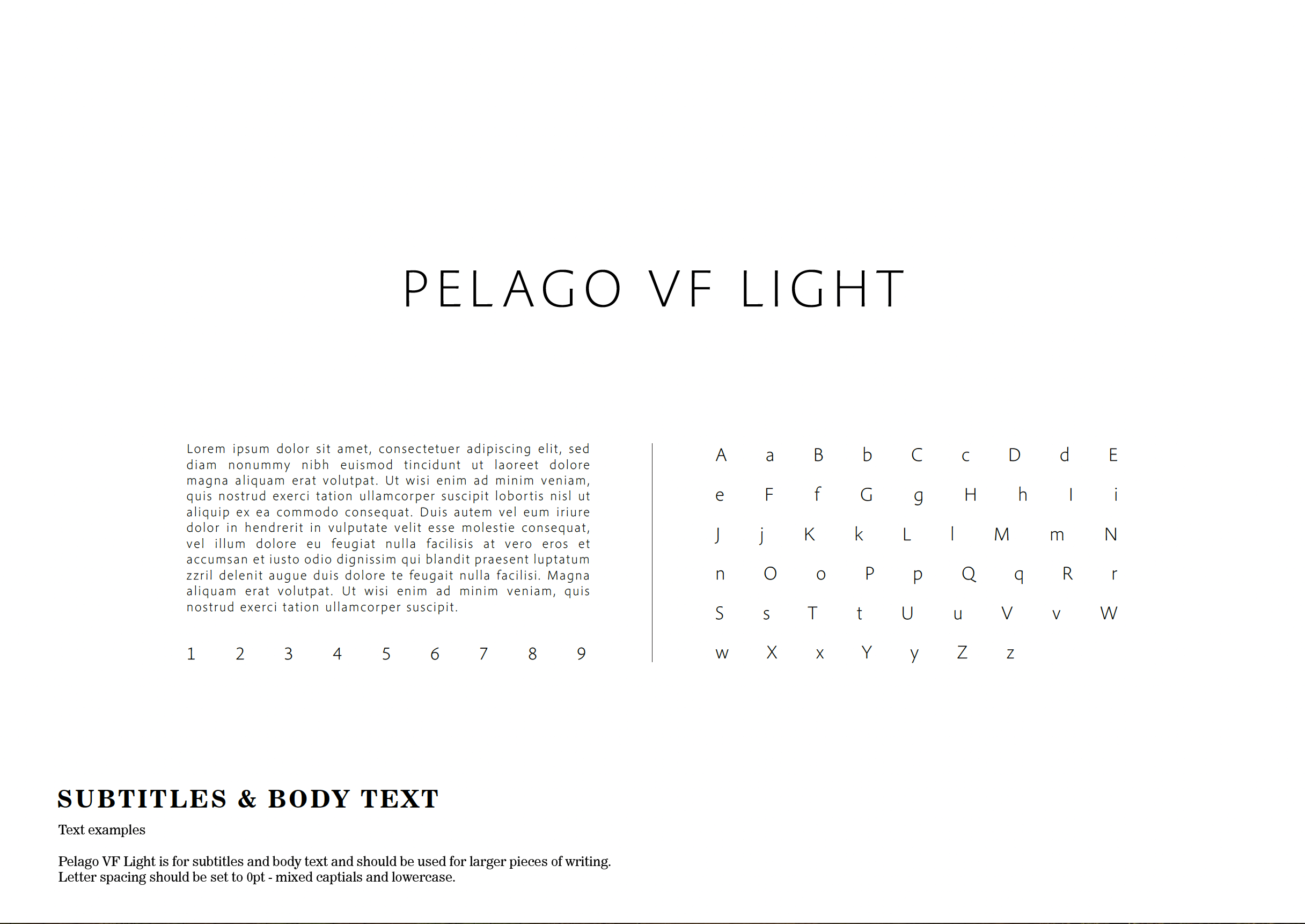
Pelago VF:
Pelago VF is utilised for the body text, offering a modern and versatile contrast to the more ornate Nightfall. This font ensures readability and adds a contemporary touch, enhancing the overall design's clarity and appeal.
Combined Impact:
The combination of these two fonts achieves a balanced and cohesive look. Nightfall’s elegance captures attention and sets a high-end tone, while Pelago VF provides a readable and modern complement.
By integrating these fonts into various elements, such as marketing materials, social media, and stationery, ORAYA Retreats can maintain a consistent and visually appealing brand identity that resonates with their audience.


Colour Palette
A refined blend of natural and luxurious tones, consisting of Earth, Olive Green, Quail, and Oyster. Each color is thoughtfully chosen to reflect the brand’s essence of tranquility and elegance.
Earth (#705454) - A rich, warm brown symbolizing stability and reliability, grounding the palette with a serene and calming presence.
Olive Green (#77825C) - A lively and refreshing tone representing renewal and vitality, perfectly aligning with the brand’s focus on well-being and rejuvenation.
Quail (#A6A19E) - A soft, neutral grey adding sophistication and versatility, enhancing the overall harmony and balance of the palette.
Oyster (#DBD4CA) - A light, neutral shade signifying purity and simplicity, providing refinement and luxury, ideal for backgrounds and accents.
This cohesive colour palette ensures ORAYA Retreats' visual identity is serene and luxurious, reflecting its commitment to beautiful, tranquil experiences. The harmonious tones are versatile for both web and print, maintaining consistent and appealing branding across all media.


Style of Imagery
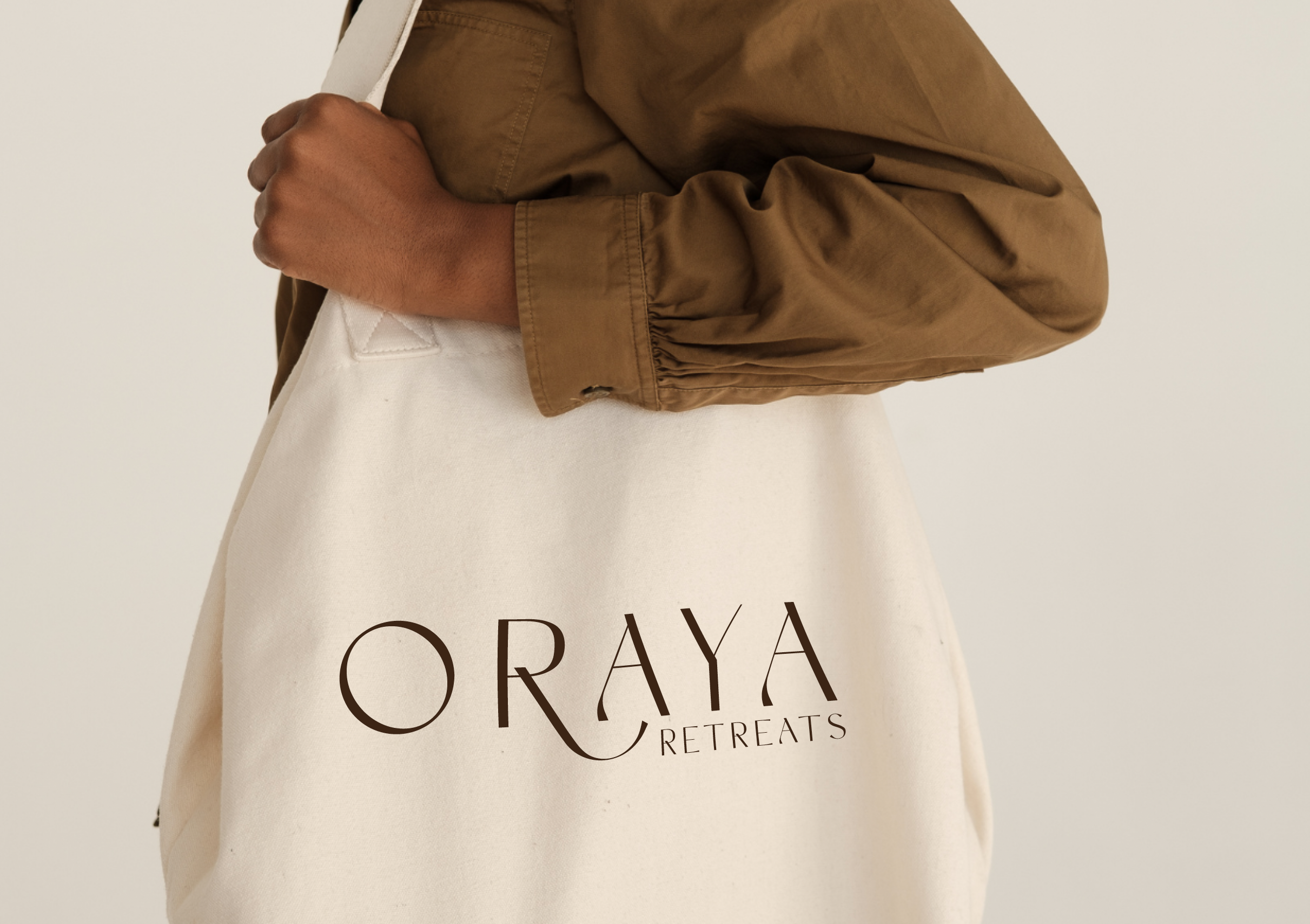
Minimalistic and clean compositions featuring natural textures like woven baskets and greenery. The images for ORAYA should use sophisticated neutral tones that align with the brand’s colour palette. High-quality lifestyle shots can incorporate ORAYA branded items, ensuring brand consistency and reinforcing the luxury and serene nature of the brand. This cohesive visual strategy effectively communicates ORAYA Retreats' essence of serene luxury and well-being.